Power BI
A Deep Dive Into Power BI's Top Features
Unleash the power of Microsoft's Power BI with its top features for transforming raw data into actionable insights.
In this blog, we will show the Microsoft Windows and Microsoft Power BI accessibility features that help individuals with disabilities.
The Americans with disabilities Act prohibit discrimination against individuals with disabilities. In fact, section 508 requires “… Federal agencies to make their electronic and information technology (EIT) accessible to people with disabilities.” That is why choosing the right technology that reflects the diversity of all its users is essential.
In this blog, we will show the Microsoft Windows and Microsoft Power BI accessibility features.
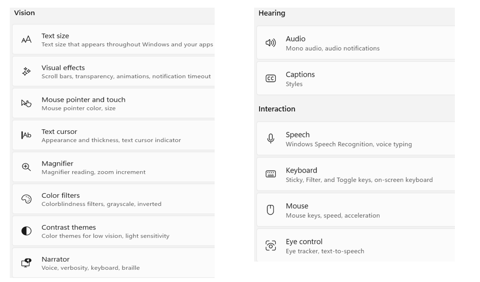
Microsoft Windows and its applications have built-in tools to assist users and ensure everyone can have access to pertinent information. Each Windows Settings, accessibility feature can be configured by disabled users to match their needs. In most cases the defaults will work just fine.
Below are the features that can be configured:
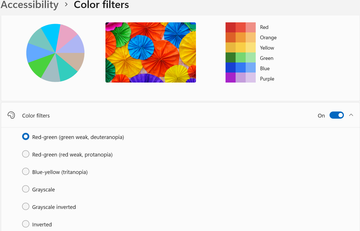
Let us look at the example of color filtering. The default setting is to have the color filters turned off. When choosing to turn them on, you can pick the selection that fits your case. This will result in colors changing everywhere within Windows and enhance visual access for a given disability.
Example of the Accessibility Settings with color filter turned on
Even though the scope of our blog is mostly for Power BI users and developers, it would be best to finalize your configurations in Windows first. When it comes to your published Power BI reports or Apps, below are two settings that could be useful.
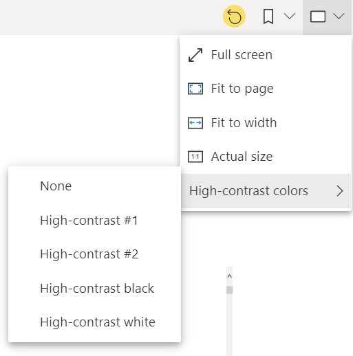
1. Selecting Power BI contrast settings
When you open your published Power BI report or apps, click on the View icon, and scroll to the high-contrast colors and choose high-contrast white. This will invert web page background and text colors. It is best to note that different color backgrounds will have different visual effects.
This is an example of a visual before and after applying the high-contrast white.
Before After
2. Selecting Power BI keyboard shortcuts
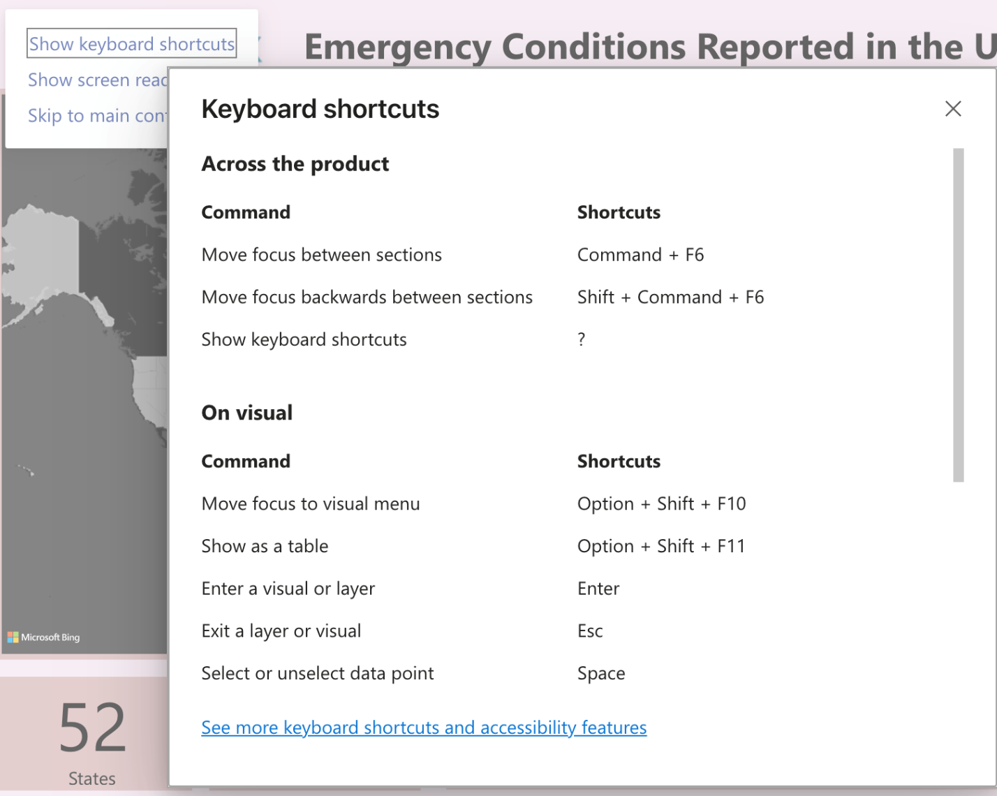
Your published Power BI reports or apps have keyboard shortcuts features for those with hand mobility issues. To find those shortcuts, you can click on the Tab key on your keyboard while in the app and the selection below shows up.
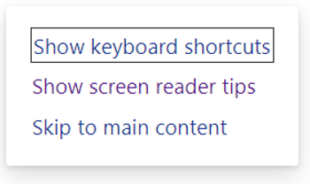
After this pop-up window appear, click on Show keyboard shortcuts and the following shortcuts as shown below will be displayed:
In summary, it would be best if users work through the Windows accessibility settings that are applicable to them, whether it is vision, hearing, or interaction settings. When it comes to published Power BI app or workspace reports, keep in mind that there are three main accessibility features: keyboard shortcuts, contrasting viewing options, and Ctrl+ mouse scroll wheel to zoom in and out of visuals.
Unleash the power of Microsoft's Power BI with its top features for transforming raw data into actionable insights.
This blog will explore how Microsoft Fabric, an end-to-end analytics solution, can be a game-changer in turning hospital data into tangible value.
Explore the differences between a data lakehouse, warehouse, and data mart in Microsoft Fabric. Discover which option is best for your Power BI...