There are several laws in the United States requiring electronic communications to be accessible to people with disabilities. Section 508 requires “... Federal agencies to make their electronic and information technology (EIT) accessible to people with disabilities.” The Americans with Disabilities Act (ADA) prohibits discrimination against individuals with disabilities. The scope of this blog is not to do a deep dive into all the legalities of Section 508 compliance, but to discuss best practices for creating visuals so that the instances of compliance never need to become an issue for the reports and dashboard you produce.
Syntrix consumes many training videos and studies many examples of BI visuals in the health care industry. Many of these resources tout the need for colors that pop and wow the audience. They insinuate that if you do not create a dashboard with trendy colors like theirs, the executives will be bored and unimpressed with the quality data. In return, disregarding the fact that 1 in 12 men and 1 in 200 women have some form of color blindness. Over 27% of people experience blurred vision and prescription glasses cannot completely correct for these conditions. Generally speaking, one-third of your audience will care more about your reports being crisp and readable rather than flashy.
In this article, we will show how to best use colors, contrast, and labeling with Power BI or any other visualization tool to create an engaging look while perfecting the readability of your report.
There are several forms of color blindness. Red–Green color blindness is the most common, of which there are 4 types. There is also Blue-Yellow color blindness where the individual confuses blue with green or yellow with violet. The key is to avoid adjacency between these colors. Green text interacting with a red background or a column chart with red and green bar colors would all be indistinguishable for the red-green disability. Likewise, blue with green or yellow with violet should be avoided in proximity to one another for those with the rarer blue-yellow condition.
Let us look at some practices you will need to avoid when creating a report.
Example 1
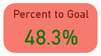
This is a Power BI Card visual for a Breast Cancer Dashboard key performance indicator (KPI). Pink is the obvious color of choice and hitting over 45% on this metrics triggers a green color for the text in the conditional formatting. This is a perfect storm. The red-green compliance flag should be flashing in your head. Oh, but wait, let us not make the indicator flash because that could trigger an epileptic seizure.
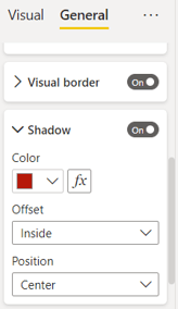
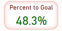
If you must use these colors because of inflexible requirement, try shading the outline instead of a solid background. This allows enough white spacing between the pink border and the green percentage number. The red and green may appear grayish to the visually disabled person, but the darkness of the text will now contrast with the white background. Below is what you will need to apply in your visual edits in Power BI to achieve the new card design.
In general, avoid solid backgrounds on visuals that have red, green, blue, yellow, or violet. This will keep you from accidentally creating an incompatible color combination. Pale contrasted with dark will make your reporting more readable.
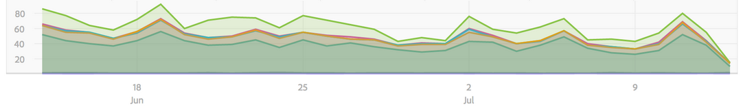
An online search for area charts revealed many problem examples. The next three graphs below are a just a few cases.
Example 2
This is an example of a beautiful graph! But having green and red right next to each other makes it hard for red-green color blindness. Also, is red a positive or negative outcome? The legend does not convey that.
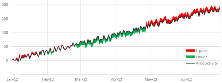
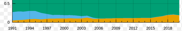
Example 3
A red-green color-blind person will not see the distinctions in this graph. Area graphs with nuanced shading are also hard for people with blurred vision to decipher.
Example 4
Presented here is a blue-green color conflict. As the graph gets refreshed over time, it could become even more confusing with the area of the blue changing.
Conditional formatting is often used to color the background of a table or of a title when a certain numerical threshold is met. Red and green are common colors for these conditions. We now know this can be a problem. Including icons or labeling for a given condition is a way to resolve this. For example, conditional formatting in a table could highlight data for a status based on a numerical metric. Example descriptive statuses are ‘Meets Expectations,’ ‘At Risk,’ ‘Completed,’ ‘In Progress,’ ‘Not Started,’ etc. This extra row information in the table makes it independent of the conditional color formatting.
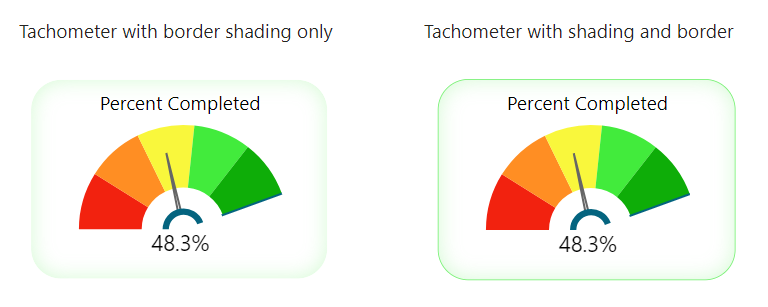
Example 5
Below is a Power BI key performance indicator application visual. Even though red and green are on the visual, they are separated by another distinct color on a white background. The tachometer needle is numerically labeled to convey the necessary information. We have two versions. The left tachometer merely has shadowing that creates the actual border. This visual look more blended and calmer but it is difficult to process for those with blurred vision. The right tachometer has a green outer border and is more distinct. Crisper contrast is better for those with blurred vision.
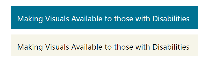
When using text, it is important to always use stark contrast between light and dark. Anything in the intermediate spectrum between text and background is hard for the eye to quickly distinguish. Make your text large enough so that older readers can easily see the text. Power BI font size of 12 or greater is usually adequate. Sometimes in graphs, the labeling needs to be smaller to make all aspects of the visual work together.
Example 6
These title pages below are both easy for the reader to distinguish the text.
In summary, making visuals more readable to the visually impaired does not inhibit the use of colors, conditional formats, or of more advance visuals. However, it does require skills in how to use these tools.
Remember, not everyone will see the graph the same way you do.