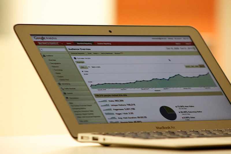
Analytics are rapidly becoming a cornerstone for a large number of healthcare providers in how they view their business by allowing executives and managers to make decisions based on data, and then to follow up the impact on these decisions and see what systems have been affected. One of the largest challenges facing these managers and executives is how to best make use of all the data generated, because the sheer volume of information can be overwhelming. The way the data is presented on your healthcare analytic dashboard can be just as important as the data that is presented. Below are some hints that can help you make the most of your dashboard by presenting your analytics in a meaningful and engaging way.
Understanding the audience
The key to presenting healthcare analytics data meaningfully is to know who is going to be using it, and understanding their needs. Some managers may have a deep interest in healthcare analytics and may understand what the performance metrics mean. Other managers are too busy and will require much more context to gain understanding. Data has presented in a manner tailored to the audience in order to be as effective as possible.
Summarize performance meaningfully
In order to make good data-driven decisions, four main things are needed:
- Access to the data
- The ability to analyze relevant data
- The ability to understand what caused the performance
- The power to make decisions
In many healthcare practices, there is a disconnect between the people generating the analytics and the people using them, meaning that many managers are not in a position to meaningfully analyze and understand what caused the changes in data. This is something that the person responsible for summarizing the data has to keep in mind, by noting the following during any presentation of the analytics:
- Insights, such as indicating the reasons for performance rather than simply stating that performance increased.
- Recommendations for action based on these metrics. You don’t have to make the decision, but you can provide various actions that can be taken based upon performance.
- Analysis of the impact that would occur if the manager took the recommendations made. This can be difficult, since analysis may not have the tools required to compute the impact of recommended actions, or may not have the time to do so.
Presenting the dashboard in a way that tells a story is much better than simply dumping data on somebody that may not have the time to get a deep understanding of what the metrics mean. Giving background to the metrics can simplify the decision-making process quite drastically.
Use data visualization effectively
All analytics dashboards will provide tools for visualization that include a plethora of graphs that can be integrated into reports. However, this leads back to the problem of simply dumping data onto a person with no context as to why this data is meaningful. There are plenty of interactive ways that data can be visualized, allowing the data to stand on its own and allowing those who want additional information to be able to do so. A good example of illustrating analytics data interactively would be to have an interactive map that is color-coded, providing relevant information at a glance while allowing the user to further click on and explore the map for more details.
Conclusion
Healthcare analytics can provide plenty of information, but how this information is presented will mean the difference between data-driven decisions and gut-based decisions made on misunderstood information. The analytics have to be summarized to prevent information overload and presented in a manner that is clear and concise.
Photo credit: bluefountainmedia / Foter / CC BY